Subscription Retention Report
Let’s talk about Churn–or Subscription Retention.
Your churn rate is the loss of customers over a period of time, usually shown over the course of a year. While your business will always have some churn, your goal is to keep this down as much as possible, because keeping a customer is much more cost-effective than trying to convert new customers.
So what is your churn rate, you may ask?
In your reports, under subscriptions, you’ll see an option for “retention” and this is the Union report created to help you track your churn.
In this report, you’ll find two different charts. The first chart shows your church rate visually over time (depending on what time period you have selected). Each color is a month of the year the subscribers joined, you can then watch their journey over time. If that color block starts to get thinner that tells you that that month of subscribers has slowly started to unsubscribe over time.
Let’s take a deeper look at this.
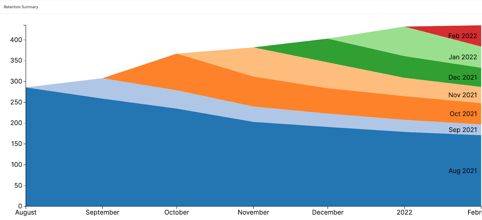
In this example, we’re looking at a time frame of 6-months. The dark blue section shows everyone who subscribed in the month of August. It looks to be around 275 people. When we look at the blue section in February it’s down to about 200. So we know that 75 of those original 275 people have unsubscribed over the course of 6-months. You can then see this pattern for each of the months based on their colors.
The other thing you can read from this chart is a general rise in subscribers overall. The top edge of this graph continues to move upwards. This shows, that even though some subscribers are being lost, new ones are coming in and making up for that loss, and then some. October is a great example to see a high rise in subscribers as there is a bigger peak in that part of the graph. November, December, and January all had a steady increase in subscribers whereas in February we’re seeing things level off–No new growth.
When looking at your graph the goal is for it to look like a layered cake (similar to the example above). This means that your churn rate is low. The example below shows an Org that has a higher churn rate and therefore the layers in the graph have a steeper curve.
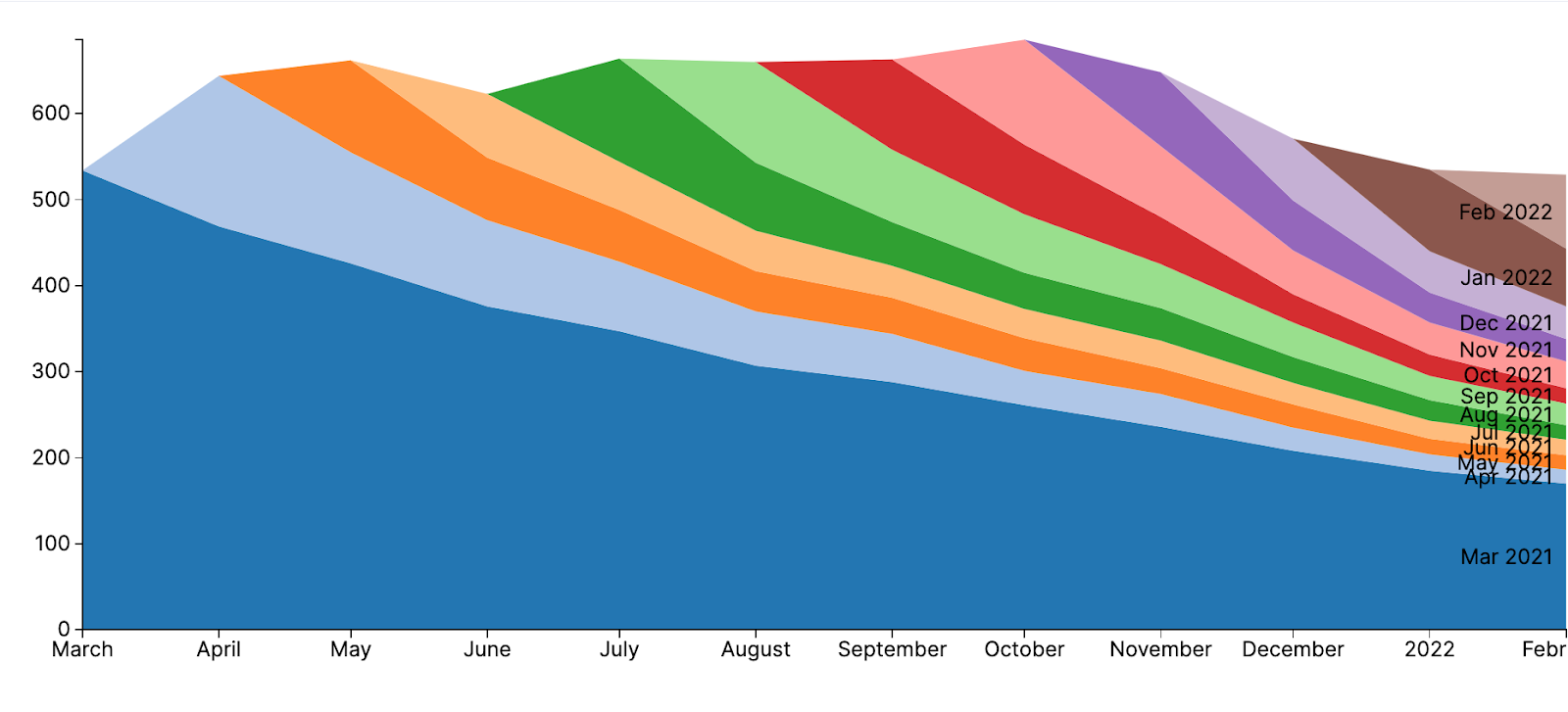
In this example of churn, we see that in March, April, and May of 2021 this Org had steady growth. Then things kind of ebb and flow until we reach December and head into 2022 where there is a more regular decline in subscribes. The steep slopes show that customers aren’t staying on as long as you’d like.
With a churn graph like this, you can see that changes need to be made to keep your subscribers on. That could be anything from price, more benefits, or better marketing to ensure that your subscribers are clear on all the benefits they get with this subscription. (Check out this blog post about creating a new subscriber email funnel).
Now that you understand the first graph, we have a 2nd graph on this page that shows you this same information in a different way.
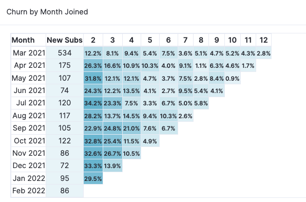
This graph breaks down the percentage of people who have churned (unsubscribed) each month. Everyone who signed up in March of 2021 is in the New Subscribers box. Then in the 2nd month of subscription (April) 12.2% unsubscribed. In the 3rd month, 8.1% unsubscribed, and so on.
One thing this graph helps us see is a trend of cancelations so we see that the highest cancel rate is the 2nd month, which is common especially if you have an intro offer to your subscriptions. But we start to see the percentage totals drop by the 5th month which means if you can keep a subscriber on for 5 months you’re more likely to keep them for the long run. With this knowledge, you could decide to create a 6-month subscription at a lower rate, or maybe after someone has been a subscriber for 4-months they get a special perk that you send to their email to show how much you appreciate them.
All Orgs will see some churn but you have the ability to decrease churn by creating a great user experience, offering valuable classes, having competitive pricing, and always putting your customers first.